The scatterplot is the basic tool for graphically displaying bivariate quantitative data.
Example:
Some investors think that the performance of the stock market in January is a good predictor of its performance for the entire year. To see if this is true, consider the following data on Standard & Poor's 500 stock index (found in SASDATA.SANDP).
| Percent | Percent | |
| January | 12 Month | |
| Year | Gain | Gain |
| 1985 | 7.4 | 26.3 |
| 1986 | 0.2 | 14.6 |
| 1987 | 13.2 | 2.0 |
| 1988 | 4.0 | 12.4 |
| 1989 | 7.1 | 27.3 |
| 1990 | -6.9 | -6.6 |
| 1991 | 4.2 | 26.3 |
| 1992 | -2.0 | 4.5 |
| 1993 | 0.7 | 7.1 |
| 1994 | 3.3 | -1.5 |
Figure 1 shows a scatterplot of the
percent gain in the S&P index over the year (vertical axis)
versus the percent gain in January (horizontal axis). Each point is
labelled with its corresponding year.
![\begin{figure}
\centerline{\includegraphics*[height=6in,width=6in]{lect9f1.ps}}
\vspace{2ex}\end{figure}](img1.gif)
The scatterplot of the S&P data can illustrate the general analysis of scatterplots. You should look for:
- Association. This is a pattern in the scatterplot.
- Type of Association. If there is
association, is it:
- o
- Linear.
- o
- Nonlinear.
- Direction of Association.
For the S&P data, there is association. This shows up as a general
positive relation
(Larger % gain in January is generally associated with larger %
yearly gain.)
It is hard to tell if the association is linear, since the spread of
the data is increasing with larger January % gain. This is due
primarily to the 1987 datum in the lower right corner of plot, and to
some extent the 1994 datum. Eliminate those two points, and the
association is strong linear and positive, as Figure 2 shows.
![\begin{figure}
\centerline{\includegraphics*[height=6in,width=6in]{lect9f2.ps}}
\vspace{2ex}\end{figure}](img2.gif)
There is some justification for considering the 1987 datum atypical. That was the year of the October stock market crash. The 1994 datum is a mystery to me.
Data smoothers can help identify and simplify patterns in large sets of bivariate data. You have already met one data smoother: the moving average.
Another is the median trace.
Pearson Correlation
Suppose n measurements, ![]() are taken
on the variables X and Y. Then the Pearson correlation between X
and Y computed from these data is
are taken
on the variables X and Y. Then the Pearson correlation between X
and Y computed from these data is
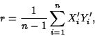
![]()
- Pearson correlation is always between -1 and 1. Values near 1 signify strong positive linear association. Values near -1 signify strong negative linear association. Values near 0 signify weak linear association.
- Correlation between X and Y is the same as the correlation between Y and X.
- Correlation can never by itself adequately summarize a
set of
bivariate data.
Only when used in conjunction with
 ,
,  , SX, and SY
and a scatterplot can an adequate summary be obtained.
, SX, and SY
and a scatterplot can an adequate summary be obtained.
- The meaningfulness of a correlation can only be judged with respect to the sample size.
If n is the sample size,
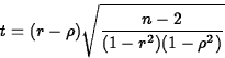
Example:
Back to the S&P data, the SAS macro CORR gives a 95% confidence
interval for ![]() as
as
(-0.2775, 0.8345). As this interval contains
0, it indicates no significant linear association between JANGAIN and
YEARGAIN.
If we remove the 1987 and 1994 data, a different story emerges. Then
the Pearson correlation is r=0.9360, and a 95% confidence
interval for ![]() is (0.6780, 0.9880). Since this interval consists
entirely of positive numbers, we conclude that
is (0.6780, 0.9880). Since this interval consists
entirely of positive numbers, we conclude that ![]() is positive and
we estimate its value to be between 0.6780 and 0.9880.
is positive and
we estimate its value to be between 0.6780 and 0.9880.
QUESTION: What is ![]() ? Does this make sense?
? Does this make sense?
The SLR model attempts to quantify the relationship between a single predictor variable Z and a response variable Y. This reasonably flexible yet simple model has the form
![]()
By looking at different functions X, we are not confined to linear relationships, but can also model nonlinear ones. The function X is called the regressor. Often, we omit specifying the dependence of the regressor X on the predictor Z, and just write the model as
![]()
We want to fit the model to a set of data ![]() . As with the C+E model, two options are least absolute
errors, which finds values b0 and b1 to minimize
. As with the C+E model, two options are least absolute
errors, which finds values b0 and b1 to minimize
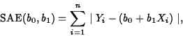
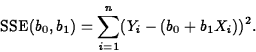
We'll concentrate on least squares. Using calculus, we find the least
squares estimators of ![]() and
and ![]() to be
to be
![]()
![]()
The relevant SAS/INSIGHT output for the regression of YEARGAIN on JANGAIN is shown in Figure 3.
![\begin{figure}
\centerline{\includegraphics*[height=6in,width=6in]{lect7f1.eps}}
\vspace{2ex}\end{figure}](img21.gif)
And the relevant SAS/INSIGHT output for the regression of YEARGAIN on JANGAIN, with the years 1987 and 1994 removed, is shown in Figure 4.
![\begin{figure}
\centerline{\includegraphics*[height=6in,width=6in]{lect7f2.eps}}
\vspace{2ex}\end{figure}](img22.gif)
- The predicted value of Y at X is
- For X=Xi, one of the values in the data set, the
predicted value is called a fitted value and is written
- The residuals,
 are the
differences between
the observed and fitted values for each data value:
are the
differences between
the observed and fitted values for each data value:
- Residuals. Residuals should exhibit no
patterns when plotted versus the Xi,
 or other
variables, such as time order. Studentized residuals should be
plotted on a normal quantile plot.
or other
variables, such as time order. Studentized residuals should be
plotted on a normal quantile plot.
- Coefficient of Determination. The
coefficient of determination, r2, is a measure of (take
your pick):
- o
- How much of the variation in the response is ``explained'' by the predictor.
- o
- How much of the variation in the response is reduced by knowing the predictor.
- The Fitted Slope. The fitted slope may be
interpreted in a couple of ways:
- o
- As the estimated change in the
mean response per unit
increase in the regressor. This is another way of saying it is the
derivative of the fitted response with respect to the regressor:
- o
- In terms of the estimated change
in the mean response per unit increase in the predictor. In this
formulation, if the regressor X, is a differentiable function of
the predictor, Z,
so
- The Fitted Intercept. The fitted intercept is the estimate of the response when the regressor equals 0, provided this makes sense.
- The Mean Square Error. The mean square error
or MSE, is an estimator of the variance of the error terms
 ,in the simple linear regression model. Its formula is
It measures the ``average squared prediction error'' when using the regression.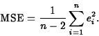
![]()
- The Fitted Slope. The fitted slope, 2.3626 is interpreted as the estimated change in YEARGAIN per unit increase in JANGAIN.
- The Fitted Intercept. The fitted intercept, 9.6462, is the estimated YEARGAIN if JANGAIN equals 0.
- The Mean Square Error. The MSE, 21.59, estimates the variance of the random errors.
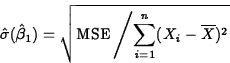
Estimation of Slope and Intercept
Level L confidence intervals for ![]() and
and ![]() are
are
![]()
![]()
![\begin{displaymath}
\hat{\sigma}(\hat{\beta}_0)=\sqrt{\mbox{MSE} \left/
\left[\f...
...rline{X}^2}{\sum_{i=1}^n(X_i-\overline{X})^2}\right]\right
.} ,\end{displaymath}](img35.gif)
![]()
![]()
NOTE: Whether the interval for ![]() contains 0 is of
particular interest. If it does, it means that we cannot statistically
distinguish
contains 0 is of
particular interest. If it does, it means that we cannot statistically
distinguish ![]() from 0. This means we have to consider plausible
the model for which
from 0. This means we have to consider plausible
the model for which ![]() :
:
![]()
The mean response at X=x0 is
![]()
![]()
![]()
![\begin{displaymath}
\hat{\sigma}(\hat{Y}_0)=\sqrt{\mbox{MSE}\left[\frac{1}{n}+\frac{(x_0-\overline{X})^2}{\sum(X_i-\overline{X})^2}\right]}.\end{displaymath}](img49.gif)
A level L prediction interval for a future observation at X=x0 is
![]()
![]()
![]()
![\begin{displaymath}
\hat{\sigma}(Y_{new}-\hat{Y}_{new})=\sqrt{\mbox{MSE}\left[1+...
...+\frac{(x_0-\overline{X})^2}{\sum(X_i-\overline{X})^2}\right]}.\end{displaymath}](img53.gif)
The macro REGPRED will compute confidence intervals for a mean response and prediction intervals for future observations for each data value and for other user-chosen X values.
The SAS macro REGPRED was run on the reduced S&P data, and estimation of
the mean response and prediction of a new observation at
the value JANGAIN=5 were requested. Both ![]() and
and ![]() equal 9.65+(2.36)(5)=21.46. The macro computes a 95% confidence interval
for the mean response at JANGAIN=5 as (16.56,26.36), and a 95%
prediction interval for a new observation at JANGAIN=5 as (9.08,33.84).
equal 9.65+(2.36)(5)=21.46. The macro computes a 95% confidence interval
for the mean response at JANGAIN=5 as (16.56,26.36), and a 95%
prediction interval for a new observation at JANGAIN=5 as (9.08,33.84).
If the standardized responses and regressors are
![]()
![]()
Then the regression equation fitted by least squares can be written as
![]()
The Regression Effect refers to the phenomenon of the standardized predicted value being closer to 0 than the standardized regressor. Equivalently, the unstandardized predicted value is fewer Y standard deviations from the response mean than the regressor value is in X standard deviations from the regressor mean.
For the S&P data r=0.4295, so for a January gain ![]() standard deviations (SX)
from
standard deviations (SX)
from ![]() , the regression equation estimates a gain for the
year of
, the regression equation estimates a gain for the
year of
![]()
With 1987 and 1994 removed, the estimate is
![]()
Analysis of categorical data is based on counts, proportions or percentages of data that fall into the various categories defined by the variables.
Some tools used to analyze bivariate categorical data are:
- Mosaic Plots.
- Two-Way Tables.
A survey on academic dishonesty was conducted among WPI students in 1993 and again in 1996. One question asked students to respond to the statement ``Under some circumstances academic dishonesty is justified.'' Possible responses were ``Strongly agree'', ``Agree'', ``Disagree'' and ``Strongly disagree''. The 1993 results are shown in the following 2x2 table and in the mosaic plots in Figure 5 and 6:
| 1993 Survey | |||||
| Dishonesty Sometimes Justified | |||||
| Frequency | |||||
| Percent | |||||
| Row Pct. | Strongly | ||||
| Col Pct. | Agree | Disagree | Disagree | Total | |
| Male | 31 | 71 | 30 | 132 | |
| 17.32 | 39.66 | 16.76 | 73.74 | ||
| 23.48 | 53.79 | 22.73 | |||
| 65.96 | 79.78 | 69.77 | |||
| Gender | |||||
| Female | 16 | 18 | 13 | 47 | |
| 8.94 | 10.06 | 7.26 | 26.26 | ||
| 34.04 | 38.30 | 27.66 | |||
| 34.04 | 20.22 | 30.23 | |||
| Total | 47 | 89 | 43 | 179 | |
| 26.26 | 49.72 | 24.02 | 100.00 |
![\begin{figure}
\centerline{\includegraphics*[height=6in,width=6in]{honesty1.ps}}
\vspace{2ex}\end{figure}](img62.gif)
![\begin{figure}
\centerline{\includegraphics*[height=6in,width=6in]{honesty2.ps}}
\vspace{2ex}\end{figure}](img63.gif)
Inference for Categorical Data with Two Categories Methods for comparing two proportions can be used (estimation from chapter 5 and hypothesis tests from chapter 6).
Inference for Categorical Data with More Than Two Categories: One-Way Tables
Suppose the categorical variable has c categories, and that the population proportion in category i is pi. To test
for pre-specified values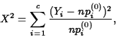
Note that for each category the Pearson statistic computes (observed-expected)2/expected and sums over all categories.
Under H0, ![]() . Therefore, if x2* is the
observed value of X2, the p-value of the test is
. Therefore, if x2* is the
observed value of X2, the p-value of the test is
![]() .
.
Example:
Historically, the distribution of weights of ``5 pound'' dumbbells
produced by one manufacturer have been normal with mean 5.01 and
standard deviation 0.15 pound. It can be easily shown that 20% of the
area under a normal curve lies within ![]() standard deviations
of the mean, 20% lies between 0.25 and 0.84 standard deviations of
the mean, 20% lies between -0.84 and -0.25 standard deviations of
the mean, 20% lies beyond 0.84 standard deviations above the mean,
and another 20% lies beyond 0.84 standard deviations below the mean.
standard deviations
of the mean, 20% lies between 0.25 and 0.84 standard deviations of
the mean, 20% lies between -0.84 and -0.25 standard deviations of
the mean, 20% lies beyond 0.84 standard deviations above the mean,
and another 20% lies beyond 0.84 standard deviations below the mean.
This means that the boundaries that break the N(5.01,0.152) density into five subregions, each with area 0.2, are 4.884, 4.9725, 5.0475 and 5.136.
A sample of 100 dumbbells from a new production lot shows that 25 lie below 4.884, 23 between 4.884 and 4.9725, 21 between 4.9725 and 5.0475, 18 between 5.0475 and 13 above 5.136. Is this good evidence that the new production lot does not follow the historical weight distribution?
Solution:
We will perform a ![]() test. Let pi be the proportion of
dumbbells in the production lot with weights in subinterval i, where
subinterval 1 is
test. Let pi be the proportion of
dumbbells in the production lot with weights in subinterval i, where
subinterval 1 is ![]() , subinterval 2 is (4.884,4.9725],
and so on. If the production lot follows the historical weight
distribution, all pi equal 0.2. This gives our hypotheses:
, subinterval 2 is (4.884,4.9725],
and so on. If the production lot follows the historical weight
distribution, all pi equal 0.2. This gives our hypotheses:
| H0: | pi | = | |
| Ha: | pi | 0.2, |
Since np(0)i=20 for each i, the test statistic is
![]()
Inference for Categorical Data with More Than Two Categories:
Two-Way Tables
Suppose a population is partitioned into rc categories, determined by
r levels of variable 1 and c levels of variable 2. The population proportion
for level i of variable 1 and level j of variable 2 is pij. These can
be displayed in the following ![]() table:
table:
| Column | Marginals | |||||
| row | 1 | 2 | ... | c | ||
| 1 | p11 | p12 | ... | p1c | ||
| 2 | p21 | p22 | ... | p2c | ||
| . | . | . | . | . | ||
| . | . | . | . | . | ||
| . | . | . | . | . | ||
| r | pr1 | pr2 | ... | prc | ||
| Marginals | ... | 1 |
We want to test
| H0: | row and column variables |
| are independent | |
| Ha: | row and column variables |
| are not independent. |
| Column | Totals | |||||
| row | 1 | 2 | ... | c | ||
| 1 | Y11 | Y12 | ... | Y1c | ||
| 2 | Y21 | Y22 | ... | Y2c | ||
| . | . | . | . | . | ||
| . | . | . | . | . | ||
| . | . | . | . | . | ||
| r | Yr1 | Yr2 | ... | Yrc | ||
| Totals | ... | n |
Under H0 the expected cell frequencies are given by
![]()
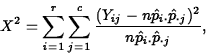
Note that for the test to be valid, we require that ![]() .
.
Example: A polling firm surveyed 269 American adults concerning how leisure time is spent in the home. One question asked them to select which of five leisure activities they were most likely to partake in on a weeknight. The results are broken down by age group in the following table, in which the cell entries are frequency, expected frequency under the hypothesis of independence of age and activity, and Pearson residual.
| Activity | |||||||
| Age | Watch | Listen | Listen | Play Computer | Totals | ||
| Group | TV | Read | to Radio | to Stereo | Game | Totals | |
| 18-25 | 21 | 3 | 9 | 10 | 19 | 62 | |
| (19.13) | (9.22) | (11.52) | (11.75) | (10.37) | |||
| (+0.43) | (-2.05) | (-0.74) | (-0.51) | (+2.68) | |||
| 26-35 | 17 | 5 | 6 | 8 | 13 | 49 | |
| (15.12) | (7.29) | (9.11) | (9.29) | (8.20) | |||
| (0.48) | (-0.85) | (-1.03) | (-0.42) | (1.68) | |||
| 36-50 | 14 | 8 | 8 | 12 | 9 | 51 | |
| (15.74) | (7.58) | (9.48) | (9.67) | (8.53) | |||
| (-0.44) | (0.15) | (-0.48) | (0.75) | (0.16) | |||
| 51-65 | 18 | 10 | 11 | 10 | 3 | 52 | |
| (16.04) | (7.73) | (9.67) | (9.86) | (8.70) | |||
| (0.49) | (0.82) | (0.43) | (0.04) | (-1.93) | |||
| Over 65 | 13 | 14 | 16 | 11 | 1 | 55 | |
| (16.97) | (8.18) | (10.22) | (10.43) | (9.20) | |||
| (-0.96) | (2.04) | (1.81) | (0.18) | (-2.70) | |||
| Totals | 83 | 40 | 50 | 51 | 45 | 269 |
As an example of the computation of table entries, consider the entries in the
(1,2) cell (age: 18-25, activity: Read), in which the observed frequency is 3.
The marginal number in the 18-25 bracket
is 62, while the marginal number in the Read bracket is 40, so
![]() , while
, while ![]() , so the expected
number in the (1,2) cell is 269(62/269)(40/269)=9.22. The Pearson residual is
, so the expected
number in the (1,2) cell is 269(62/269)(40/269)=9.22. The Pearson residual is
![]() .
The value of the chi-square statistic is 38.91, which is computed as
the sum of the squares of the Pearson residuals. Comparing this with
the chi-square distribution with 16 degrees of freedom, we get a
p-value of 0.0011.
.
The value of the chi-square statistic is 38.91, which is computed as
the sum of the squares of the Pearson residuals. Comparing this with
the chi-square distribution with 16 degrees of freedom, we get a
p-value of 0.0011.
Association is NOT Cause and Effect
Two variables may be associated due to a number of reasons, such as:
- 1.
- X could cause Y.
- 2.
- Y could cause X.
- 3.
- X and Y could cause each other.
- 4.
- X and Y could be caused by a third (lurking) variable Z.
- 5.
- X and Y could be related by chance.
- 6.
- Bad (or good) luck.
The Issue of Stationarity
- When assessing the stationarity of a process in terms of bivariate measurements X and Y, always consider the evolution of the relationship between X and Y, as well as the individual distribution of the X and Y values, over time or order.
- Suppose we have a model relating a measurement from a process to time or order. If, as more data are taken the pattern relating the measurement to time or order remains the same, we say that the process is stationary relative to the model.