- Bivariate Data: Graphical Display
The scatterplot is the basic tool for graphically
displaying bivariate quantitative data.
Example:
Some investors think that the performance of the stock market in
January is
a good predictor of its performance for the entire year.
To see if this is true, consider the following data on
Standard & Poor's 500 stock index (found in SASDATA.SANDP).
| |
Percent |
Percent |
| |
January |
12 Month |
| Year |
Gain |
Gain |
| 1985 |
7.4 |
26.3 |
| 1986 |
0.2 |
14.6 |
| 1987 |
13.2 |
2.0 |
| 1988 |
4.0 |
12.4 |
| 1989 |
7.1 |
27.3 |
| 1990 |
-6.9 |
-6.6 |
| 1991 |
4.2 |
26.3 |
| 1992 |
-2.0 |
4.5 |
| 1993 |
0.7 |
7.1 |
| 1994 |
3.3 |
-1.5 |
Figure 1 is a scatterplot of the
percent gain in the S&P index over the year (vertical axis)
versus the percent gain in January (horizontal axis).
Figure 1:
Percent gain in Standard and Poor's
index over the year (vertical axis) versus the percent gain in January
(horizontal axis).
![\begin{figure}
\centerline{
\includegraphics
*[height=3in,width=6in]{lect7f1.ps}}
\vspace{2ex}\end{figure}](img1.gif) |
- How to analyze a scatterplot
The scatterplot of the S&P data can illustrate the general analysis
of scatterplots. You should look for:
- Association. This is a pattern in
the scatterplot.
- Type of Association. If there is
association, is it:
- Direction of Association.
For the S&P data, there is association. This shows up as a general
positive relation (Larger % gain in January is generally associated
with larger % yearly gain.) It is hard to tell if the association is
linear, since the spread of the data is increasing with larger January
% gain. This is due primarily to the 1987 datum in the lower right
corner of plot, and to some extent the 1994 datum. Eliminate those two
points, and the association is strong linear and positive, as
Figure 2 shows.
Figure 2:
Percent gain in Standard and Poor's
index over the year (vertical axis) versus the percent gain in January
(horizontal axis): 1987 and 1994 removed.
![\begin{figure}
\centerline{
\includegraphics
*[height=3in,width=6in]{lect7f2.ps}}
\vspace{2ex}\end{figure}](img2.gif) |
There is some justification for considering the 1987 datum
atypical. That was the year of the October stock market crash. The
1994 datum is a mystery to me.
- Data Smoothers
Data smoothers can help identify and simplify patterns in large sets
of bivariate data. You have already met one data smoother: the moving
average. Figure 3 shows how a median trace reveals a
downward trend, indicative of non-randomness, in the 1970
draft lottery data.
Figure 3:
Draft lottery data; median trace
![\begin{figure}
\centerline{
\includegraphics
*[height=3in,width=6in]{lect7f9.ps}}
\vspace{2ex}\end{figure}](img3.gif) |
- Pearson Correlation
Suppose n measurements,  are taken
on the variables X and Y. Then the Pearson correlation between X
and Y computed from these data is
are taken
on the variables X and Y. Then the Pearson correlation between X
and Y computed from these data is
where
are the standardized data.
The scatterplots of standardized variables in Figure 4
illustrate what Pearson correlation measures.
Figure 4:
Six plots of standardized X and Y
data
![\begin{figure}
\centerline{
\includegraphics
*[height=3in,width=6in]{lect7f10.ps}}
\vspace{2ex}\end{figure}](img7.gif) |
- Good Things to Know About Pearson Correlation
- Pearson correlation is always between -1 and
1. Values near 1 signify strong positive linear
association. Values near -1 signify strong negative linear
association. Values near 0 signify weak linear association.
- Correlation between X and Y is the same as the
correlation between Y and X.
- Correlation can never by itself adequately
summarize a set of bivariate data. Only when used in
conjunction with
 ,
,  , SX, and
SY and a scatterplot can an adequate summary be
obtained.
, SX, and
SY and a scatterplot can an adequate summary be
obtained.
- The meaningfulness of a correlation can only
be judged with respect to the sample size.
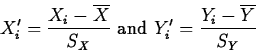
- A Confidence Interval for the Population
Correlation,

If n is the sample size,
has approximately
a tn-2 distribution. We can use this fact to obtain a confidence
interval for . - Example:
Back to the S&P data, the SAS macro CORR gives a 95% confidence
interval for as
(-0.2775, 0.8345). As this interval contains
0, it indicates no significant linear association between JANGAIN and
YEARGAIN.
If we remove the 1987 and 1994 data, a different story emerges. Then
the Pearson correlation is r=0.9360, and a 95% confidence
interval for is (0.6780, 0.9880). Since this interval consists
entirely of positive numbers, we conclude that is positive and
we estimate its value to be between 0.6780 and 0.9880.
QUESTION: What is ? Does this make sense?
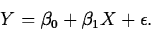
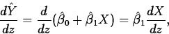
- Simple Linear Regression
The SLR model attempts to quantify the relationship between a single
predictor variable Z and a response variable Y. This reasonably
flexible yet simple model has the form
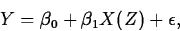
where  is a random error term, and X(Z) is a function of
Z, such as Z2 or
is a random error term, and X(Z) is a function of
Z, such as Z2 or  . By looking at different functions X,
we are not confined to linear relationships, but can also model
nonlinear ones. The function X is called the regressor.
Often, we omit specifying the dependence of the regressor X on
the predictor Z, and just write the model as
. By looking at different functions X,
we are not confined to linear relationships, but can also model
nonlinear ones. The function X is called the regressor.
Often, we omit specifying the dependence of the regressor X on
the predictor Z, and just write the model as
We want to fit the model to a set of data 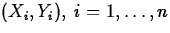 . As with the C+E model, two options are least absolute
errors, which finds values b0 and b1 to minimize
. As with the C+E model, two options are least absolute
errors, which finds values b0 and b1 to minimize
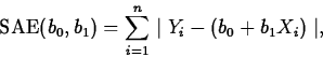
or least squares, which finds values b0 and b1 to minimize
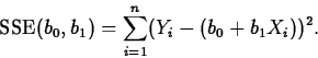
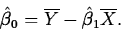
We'll concentrate on least squares. Using calculus, we find the least
squares estimators of  and
and  to be
to be
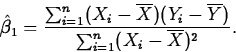
and
- Example:
For the S&P data, we would like to fit a model that can predict
YEARGAIN (the response) as a function of JANGAIN (the
predictor). Since a scatterplot reveals no obvious nonlinearity, we
will take the regressor to equal the predictor.
The relevant SAS/INSIGHT output for the regression of YEARGAIN on
JANGAIN looks like this:
Figures 5 and 6 show
SAS/INSIGHT output for the regression of YEARGAIN on
JANGAIN, with and without the years 1987 and 1994 removed,
respectively.
Figure 5:
SAS/INSIGHT output of regression
of YEARGAIN on JANGAIN: all data
![\begin{figure}
\centerline{
\includegraphics
*[height=6in,width=6in]{lect7f3.ps}}
\vspace{2ex}\end{figure}](img23.gif) |
Figure 6:
SAS/INSIGHT output of regression
of YEARGAIN on JANGAIN: 1987 and 1994 removed
![\begin{figure}
\centerline{
\includegraphics
*[height=6in,width=6in]{lect7f4.ps}}
\vspace{2ex}\end{figure}](img24.gif) |
- Residuals, Predicted and Fitted Values
- The predicted value of Y at X is
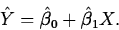
- For X=Xi, one of the values in the data set, the
predicted value is called a fitted value and is written
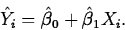
- The residuals,
 are the
differences between
the observed and fitted values for each data value:
are the
differences between
the observed and fitted values for each data value:
- Tools to Assess the Quality of the Fit
- Residuals. Residuals should exhibit no
patterns when plotted versus the Xi,
 or other
variables, such as time order. Studentized residuals should be
plotted on a normal quantile plot.
or other
variables, such as time order. Studentized residuals should be
plotted on a normal quantile plot.
- Coefficient of Determination. The
coefficient of determination, r2, is a measure of (take
your pick):
- How much of the variation in the
response is ``explained'' by the predictor.
- How much of the variation in the
response is reduced by knowing the predictor.
The notation r2 comes from the fact that the coefficient of
determination is the square of the Pearson correlation.
Check out the quality of the two fits for the S&P data:
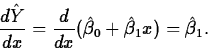
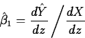
- Model Interpretation
- The Fitted Slope. The fitted slope may be
interpreted in a couple of ways:
- As the estimated change in the mean
response per unit
increase in the regressor. This is another way of saying it is the
derivative of the fitted response with respect to the regressor:
- In terms of the estimated
change in the mean response per unit increase in the
predictor. In this formulation, if the regressor X, is a
differentiable function of the predictor, Z,
so
- The Fitted Intercept. The fitted
intercept is the estimate of the response when the predictor equals 0,
provided this makes sense.
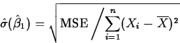
- The Mean Square Error. The mean
square error or MSE, is an estimator of the variance of the error
terms , in the simple linear regression model. Its formula
is
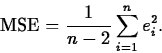
It measures the
``average prediction error'' when using the regression.
- Example:
Consider the S&P data with the 1987 and 1994 observations
omitted. The fitted model is

- The Fitted Slope. The fitted slope,
2.3626 is interpreted as the estimated change in YEARGAIN per
unit increase in JANGAIN.
- The Fitted Intercept. The fitted
intercept, 9.6462, is the estimated YEARGAIN if JANGAIN equals 0.
- The Mean Square Error. The MSE, 21.59,
estimates the variance of the random errors.
- Classical Inference for the SLR Model
- The Relation Between Correlation and Regression
If the standardized responses and predictors are
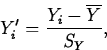
and
Then the regression equation fitted by least squares can be written as

Where X' is any value of a predictor variable standardized as
described above.
The Regression Effect refers to the phenomenon of the
standardized predicted value being closer to 0 than the standardized
predictor. Equivalently, the unstandardized predicted value is
fewer Y standard deviations from the response mean than the
predictor value is in X standard deviations from the predictor mean.
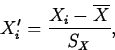
For the S&P data r=0.4295, so for a January gain  standard deviations (SX) from , the regression
equation estimates a gain for the year of
standard deviations (SX) from , the regression
equation estimates a gain for the year of
standard deviations (SY) from .
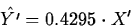
With 1987 and 1994 removed, the estimate is
which reflects the stronger relation.
- The Relationship Between Two Categorical Variables
Analysis of categorical data is based on counts, proportions
or percentages of data that fall into the various categories defined
by the variables.
Some tools used to analyze bivariate categorical data are:
- Mosaic Plots.
- Two-Way Tables.
- Example:
A survey on academic dishonesty was conducted among WPI students in
1993 and again in 1996. One question asked students to respond to the
statement ``Under some circumstances academic dishonesty is
justified.'' Possible responses were ``Strongly agree'', ``Agree'',
``Disagree'' and ``Strongly disagree''.
Table 1 contains the information for the 1993 data.
Table 1:
Table relating gender and
response to ``Under some circumstances academic dishonesty is
justified,'' 1993 survey.
|
1993 Survey: |
Dishonesty |
Sometimes |
Justified |
|
|
|
|
|
|
|
| |
Frequency |
|
|
|
|
| |
Percent |
|
|
|
|
| |
Row Pct. |
|
|
Strongly |
|
| |
Col Pct. |
Agree |
Disagree |
Disagree |
Total |
| |
|
|
|
|
|
| |
Female |
16 |
18 |
13 |
47 |
| |
|
8.94 |
10.06 |
7.26 |
26.26 |
| |
|
34.04 |
38.30 |
27.66 |
|
| |
|
34.04 |
20.22 |
30.23 |
|
| Gender |
|
|
|
|
|
| |
|
|
|
|
|
| |
Male |
31 |
71 |
30 |
132 |
| |
|
17.32 |
39.66 |
16.76 |
73.74 |
| |
|
23.48 |
53.79 |
22.73 |
|
| |
|
65.96 |
79.78 |
69.77 |
|
| |
|
|
|
|
|
| |
Total |
47 |
89 |
43 |
179 |
| |
|
26.26 |
49.72 |
24.02 |
100.00 |
Figures 9
and 10 show two mosaic plots relating the responses to
gender for the 1993 data.
Figure 9:
Mosaic plot relating gender and
response to ``Under some circumstances academic dishonesty is
justified,'' 1993 survey.
![\begin{figure}
\centerline{
\includegraphics
*[height=3in,width=6in]{lect7f7.ps}}
\vspace{2ex}\end{figure}](img64.gif) |
Figure 10:
Another mosaic plot relating gender and
response to ``Under some circumstances academic dishonesty is
justified,'' 1993 survey.
![\begin{figure}
\centerline{
\includegraphics
*[height=3in,width=6in]{lect7f8.ps}}
\vspace{2ex}\end{figure}](img65.gif) |
- Association is NOT Cause and Effect
Two variables may be associated due to a number of reasons, such as:
- 1. X could cause Y.
- 2. Y could cause X.
- 3. X and Y could cause each other.
- 4. X and Y could be caused by a third
(lurking) variable Z.
- 5. X and Y could be related by chance.
- 6. Bad (or good) luck.
- The Issue of Stationarity
- When assessing the stationarity of a process in
terms of bivariate measurements X and Y, always consider
the evolution of the relationship between X and Y, as well
as the individual distribution of the X and Y values, over
time or order.
- Suppose we have a model relating a measurement
from a process to time or order. If, as more data are taken
the pattern relating the measurement to time or order remains
the same, we say that the process is stationary relative
to the model.
![\begin{displaymath}
\hat{\sigma}(\hat{\beta}_0)=\sqrt{\mbox{MSE} \left/
\left[\f...
...rline{X}^2}{\sum_{i=1}^n(X_i-\overline{X})^2}\right]\right
.} ,\end{displaymath}](img37.gif)
![\begin{displaymath}
\hat{\sigma}(\hat{Y}_0)=\sqrt{\mbox{MSE}\left[\frac{1}{n}+
\frac{(x_0-\overline{X})^2}{\sum(X_i-\overline{X})^2}\right]}.\end{displaymath}](img49.gif)
![\begin{displaymath}
\hat{\sigma}(Y_{new}-\hat{Y}_{new})=
\sqrt{\mbox{MSE}\left[1...
...
\frac{(x_0-\overline{X})^2}{\sum(X_i-\overline{X})^2}\right]}.\end{displaymath}](img53.gif)
![\begin{figure}
\centerline{
\includegraphics
*[height=3in,width=6in]{lect7f6.ps}}
\vspace{2ex}\end{figure}](img55.gif)
![\begin{figure}
\centerline{
\includegraphics
*[height=3in,width=6in]{lect7f5.ps}}
\vspace{2ex}\end{figure}](img54.gif)